Our Mother's Crystals
Every crystal carries a story — and so does the brand behind it.
When Our Mother’s Crystals reached out, they were ready for a rebrand that reflected the energy they pour into every piece: intentional, heart-centered, and a little bit magical. Family-owned and rooted in education, Reiki, and metaphysical, their business had soul — it just needed visuals that vibrated on the same frequency.

FULL BRAND REDESIGN
THE ASK
Dana Sedoris, owner of Our Mother’s Crystals, came to me ready for a full up level. Her family-run business was rooted in spirituality, Reiki, and community — bursting with heart — but their visuals didn’t yet reflect their vibe or values.
They wanted to elevate their presence, attract more customers, and expand their educational offerings — all while keeping their grounded humor and authenticity intact.
The goal to transform Our Mother’s Crystals from a small spiritual shop into a recognizable lifestyle brand that could grow online, connect deeper with their audience, and visually embody the heart and craft behind every crystal, candle, and creation.
This meant a complete rebrand — from curated moodboards and logo design to print collateral and social templates — aligning their visuals, message, and mission into one cohesive, elevated identity.
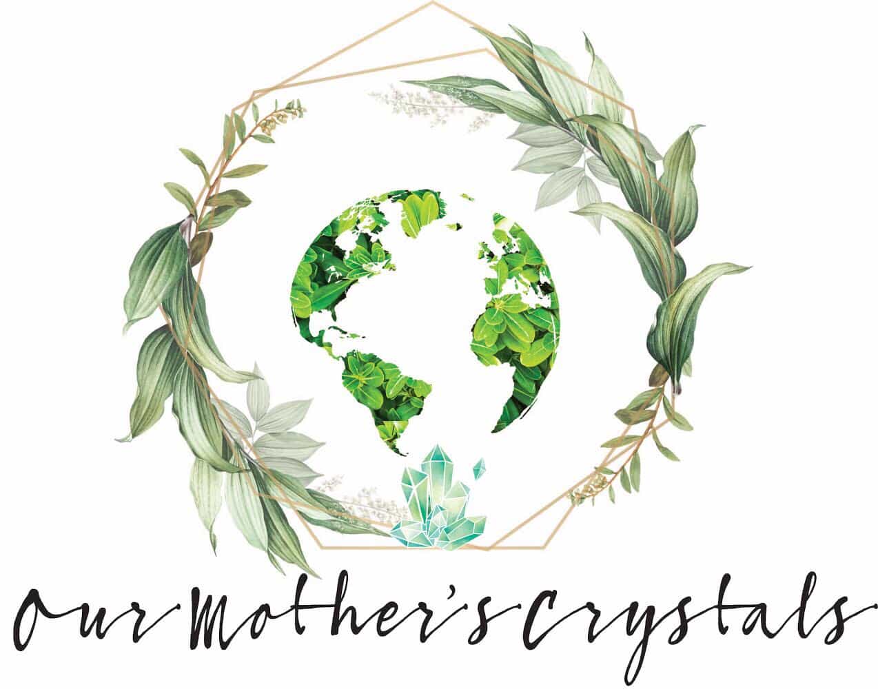
BEFORE LOGO
THE SOLUTION
The new visuals reflect the same energy they infuse into every product — cleared, Reiki-infused, and sound-healed — translating their spiritual process into a brand experience that feels both intentional and elevated.
UPDATED MAIN LOGO
Using mineral-inspired hues — moss green, rose quartz, and soft gold — paired with balanced, handcrafted typography, we created a look that bridges spiritual and stylish, sacred and modern.
Deliverables included:
- Full logo suite
- Curated color palette + brand fonts
- Business cards
- Thank-you cards
- Social media templates and profile graphics
- Crystal identification labels
Beyond the visuals, we built a complete brand system designed to help them stay consistent and purposeful across every touchpoint. From packaging and inserts to digital assets, each design became a ritual of alignment — uniting strategy, beauty, and belief into one cohesive, high-vibrational experience.
ALTERNATE STACKED MAIN LOGO
LOGOTYPE


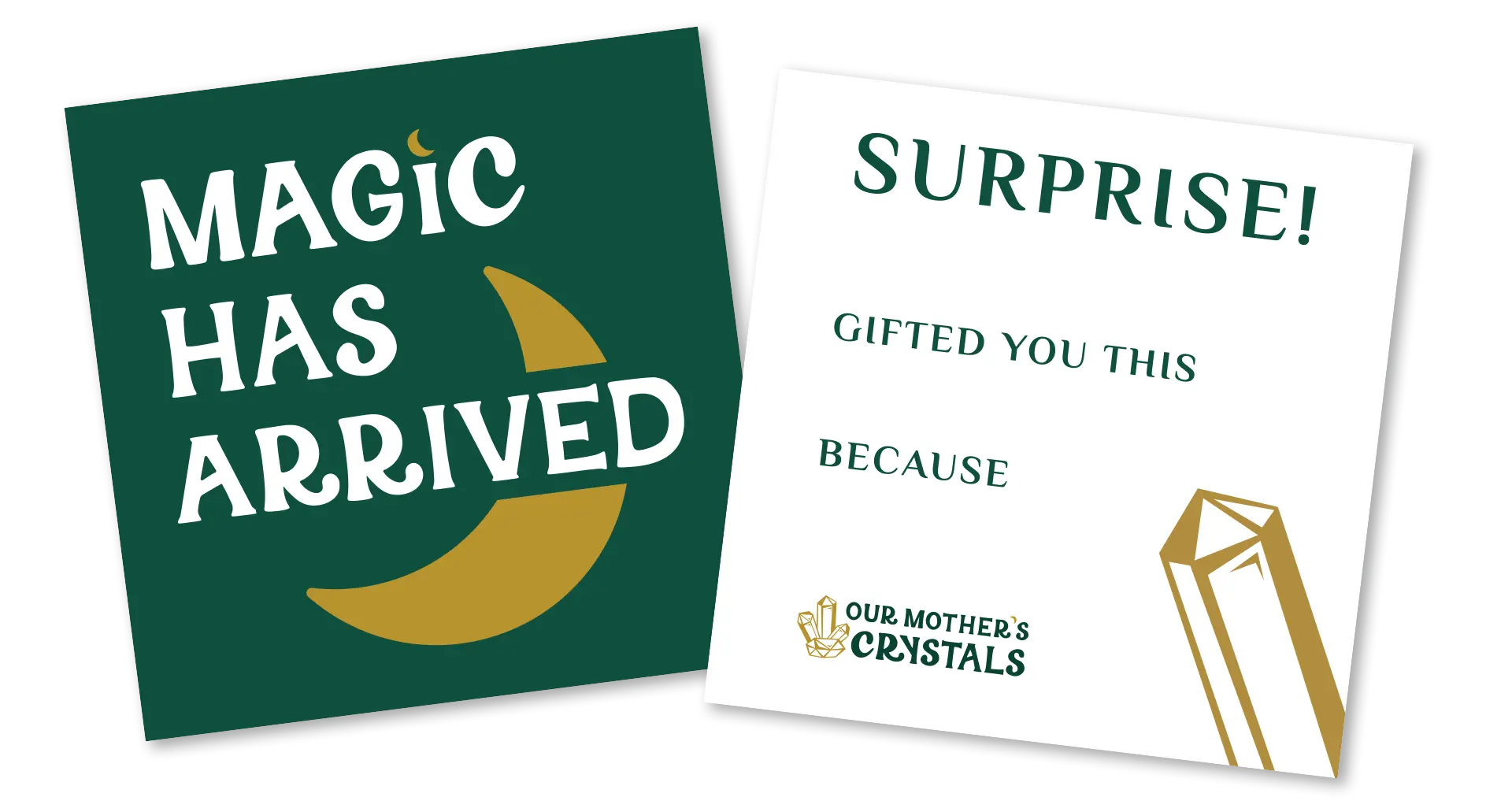
GIFTED ITEM CARD 3" x 3"
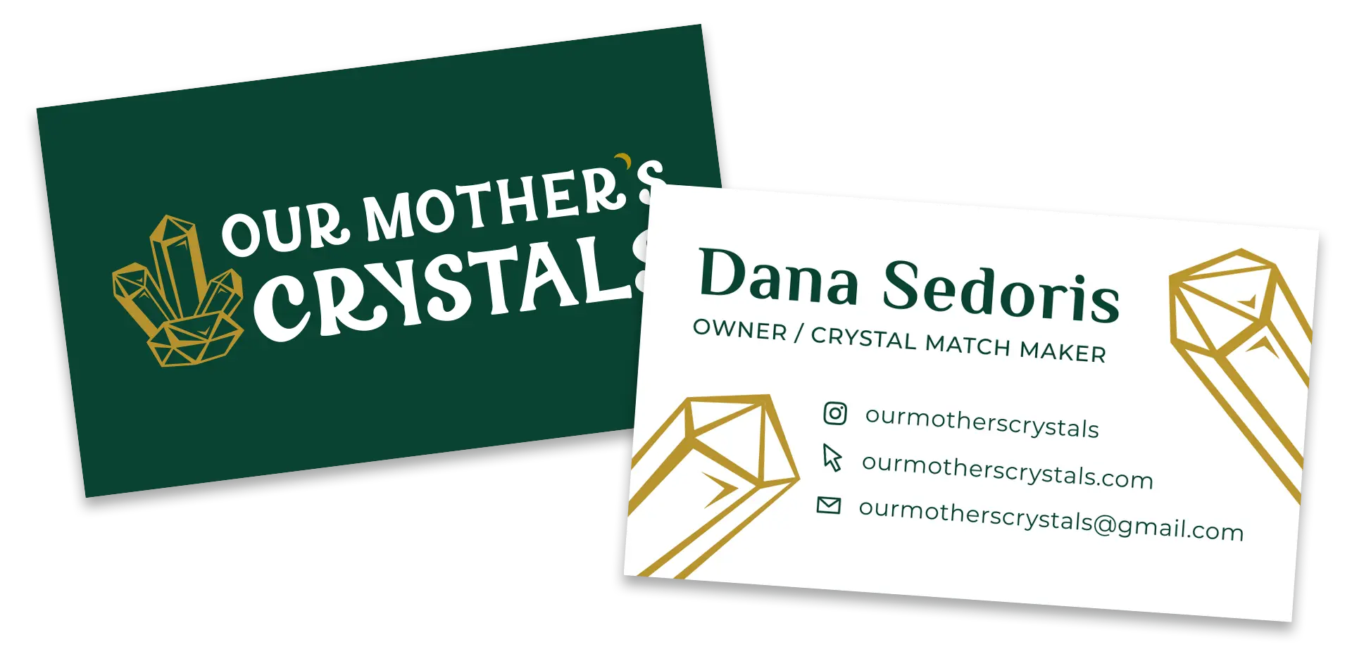
BUSINESS CARD




INITIAL LOGO
(USED FOR JEWELRY CHARMS)
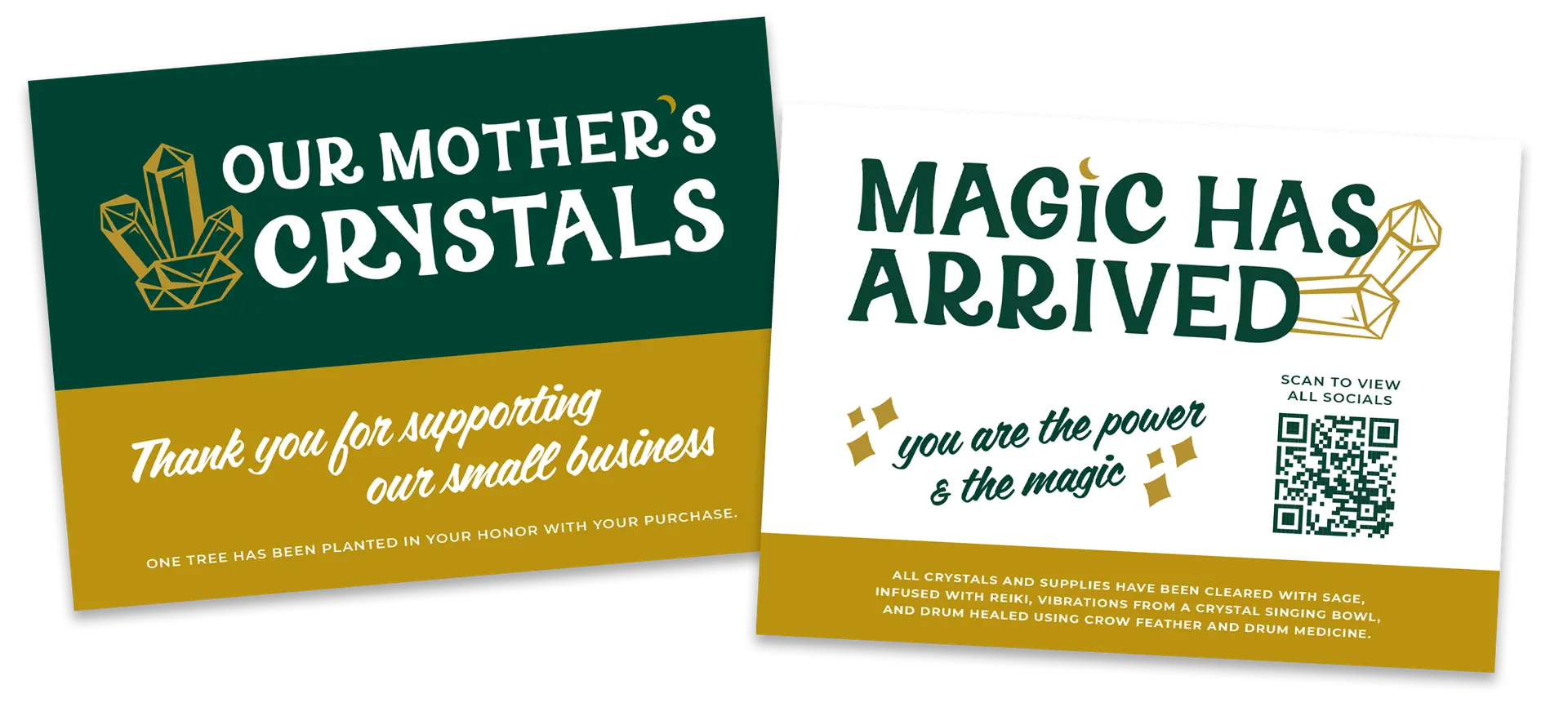
THANK YOU CARDS - SENT WITH EVERY ORDER